
Hello readers!
I mentioned at the end of Wyrd and Wonder that I was taking a short break from posting to do some maintenance. You might have noticed…
Word Wilderness got a makeover!
I had to do some backend work on the website at the end of May through the beginning of June, so it felt like a good time to implement a lot of the design changes I’ve been thinking about as a treat.
So what did I change?
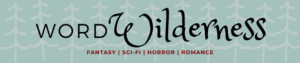
First, I wanted to slightly change my color scheme. Since I started Word Wilderness back in 2020, I’ve known that I wanted a blue/teal website with red-ish accents. Ever since my teal has been getting less teal and my red less red. Here you can see the change:
Old Website
New Website
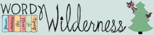
New Blog Banner and Graphics
Since I first created Word Wilderness, I wanted to create a banner and graphics with my own art and handwriting. I put this off until now because I thought the process would be too time consuming and that my art wouldn’t be good enough. I finally just went ahead and made my new graphics.
I always hated my old logo because it never seemed like it fit in with the rest of the site. I have a fantasy blog called “Word Wilderness” so I always try to include some kind of wilderness-y aspects with fantasy in my graphics. Did my old logo scream wilderness themed fantasy book blog? NO. If anything, it screams: blogger got tired of working on her blog and just slapped a couple free Canva elements together and called it a day.
The new logo definitely fits the my blog theme better.
I started fine tuning my color scheme and created my banner back in March. This month, I drew my little purple dragon (with glasses!) peaking from behind the pine tree for my new logo. I’m very happy with how everything turned out!
If you’re wondering how I did it, I have to say it was probably the most inefficient method you’ve ever heard of. But it is free :D
- Draw/write whatever you want the graphic to be
- Use Genius Scan app to get black and white image
- Upload to Pixlr Editor
- Play around with magic select, inverse selection, bucket paint, paint brush, and cuttout/mask until you either have your graphic on the same background color as the website background or you have a graphic with a transparent background. Typically I have a few lighter/white pixels around the edges of my drawing that are a pain to color in because they aren’t included in the magic select tools.
- Use Canva if needed to combine different graphics into a banner/image.
- Save and resize!
Like I said, this method is typically very time consuming. It’s probably not the best way to do it, but it’s the best way I’ve been able to figure out to make decent graphics for free.
The layout/theme
I changed the them (and so the overall layout/look) of the site. The image grid theme was starting to feel old, and I wanted my blog posts to be shown as a list. I feel like my home screen looks more modern this way. You can see a longer excerpt from my posts with this view, which I love. (I wish I took a screenshot of the old homepage to compare! Technically, I still have the old site saved as a backup, but that is just a jumble of files unless I reupload them… which sounds like too much work)
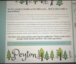
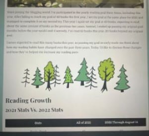
Although I don’t have any screenshots of my old home screen, I did find these photos of the old post look. One of the biggest changes is that my post background is the same blue/teal color as the rest of the site instead of white. I know that having a colored website won’t be everyone’s favorite, but I love it and it’s my blog!
No more side bar
In my old site, I had a side bar with my archives, follow buttons, etc… The thing about having a side bar is when you look at it on your phone it turns into a footer. So on mobile, I had my regular main menu at the top, my footer menu, and a second footer menu/side bar. It was overkill! I wanted to simplify my site, so I said goodbye to the side bar and just went with the main menu at the top. I considered adding the main menu to the footer, but again, it’s overkill. Word Wilderness does not have enough posts and pages to justify having more than one menu.
I felt like my old site was relatively easy to navigate (speaking as the person who designed the site and knew where everything was, lol). I tried to make the new design even easier to navigate, but definitely let me know if there are things you have trouble finding in the comments! I’ve been looking at Word Wilderness so long I can’t be trusted to have an opinion.
No more archives
Since the side bar is gone, so are my archives organized by month. I always thought the archives were fun to see, but not really useful for navigation purposes. When I visit a site, I’m usually browsing via categories or searching for a specific post/topic. I’ve never found myself going, “Let’s see what Peyton posted in July of 2023”. Especially because my monthly post count is so low! If you went into most of my archives, you would see 1-2 posts. In the end, I had no issue deleting my monthly archives. (my review archive is still up as that is a page separate from my sidebar)
Other Navigation Changes
The main menu of Word Wilderness needed a slight update to better categorize some of my posts. Before, I separated my posts into reviews and features. I further separated features into afternoon tea, events & challenges, lists, and wrap up posts. However, I was bad at categorizing posts into these buckets, so a lot of things ended up getting dumped into the afternoon tea category, which was originally only mean for bookish discussion posts. Now, I changed the name of my wrap up category to “recaps” and added the “Word Wilderness Post” category for miscellaneous reading and blogging updates.
Final thoughts…
This has been the first wave of major changes I’ve made to Word Wilderness since I created it back in 2020. It took a lot of relearning (especially on backend stuff) and there were a lot of things I did weirdly with the design elements that I had to go back and correct. You can probably look at my oldest posts and see that there are some weird formatting choices.
It’s difficult when I created something because I feel like I always look at my website and go, “oh, that color could be tweaked” or “I should adjust the spacing between those elements”. I could probably sit on my site editor and go through a never ending list of slight adjustments and improvements. Maybe that’s a good sign because it means I enjoy my hobby?
Anyway, at some point it’s time to say that’s good enough, and that’s what I’m going to say for now. Now that I’m done tinkering with the site, I’m going back to a every other Sunday posting schedule.


Comments
8 responses to “Word Wilderness 2025 Revamp”
I wasn’t here for long before you made the change, but I do like the new look!
Thank you!!
Yay! Love it Peyt ♥️♥️
Thanks for the feedback on my colors and graphics!
Love the new look! I agree it can be too easy to nitpick design choices and spend forever tweaking spacing and other details that most people will never notice, but I’m glad you’ve settled on something your happy with. Looking forward to seeing you go forward!
Thank you! And yes, it can be such a challenge to tell myself it’s time to be done!
It looks great!
Thanks!!